

The Portfolio Dashboard
Executives Actually Open.
Author
Philipp Eiselt
Topic
BI Reporting
Executive Dashboards
Published
October 2025
Read time
8 min
After building portfolio reporting tools in Power BI, SAP Analytics Cloud, and Tableau across different organisations and several years, I have watched enough steering committees to be confident about one thing: the dashboards that leadership actually opens before a meeting are not the most technically impressive ones. They are the ones that answer three specific questions, and nothing else.
The sophistication trap.
The typical lifecycle of a portfolio dashboard in a large organisation goes like this. A data or BI team builds an initial version covering project status, budget variance and milestone tracking. Leadership uses it for a cycle or two. Then someone, usually with good intentions, decides the dashboard needs to be more comprehensive. More drill-down capability is added. More KPIs are included. A dependency mapping view is built. An executive summary tab is added on top. The dashboard grows.
At some point, the dashboard stops being used before governance meetings and starts being used only by the people who built it. Leadership has not rejected it; they have quietly found it easier to call the PMO lead and ask for a verbal update. The information is in the dashboard, but getting to it requires effort and interpretation that leadership does not want to supply. The dashboard has become a data warehouse with a front end, rather than a decision support tool.
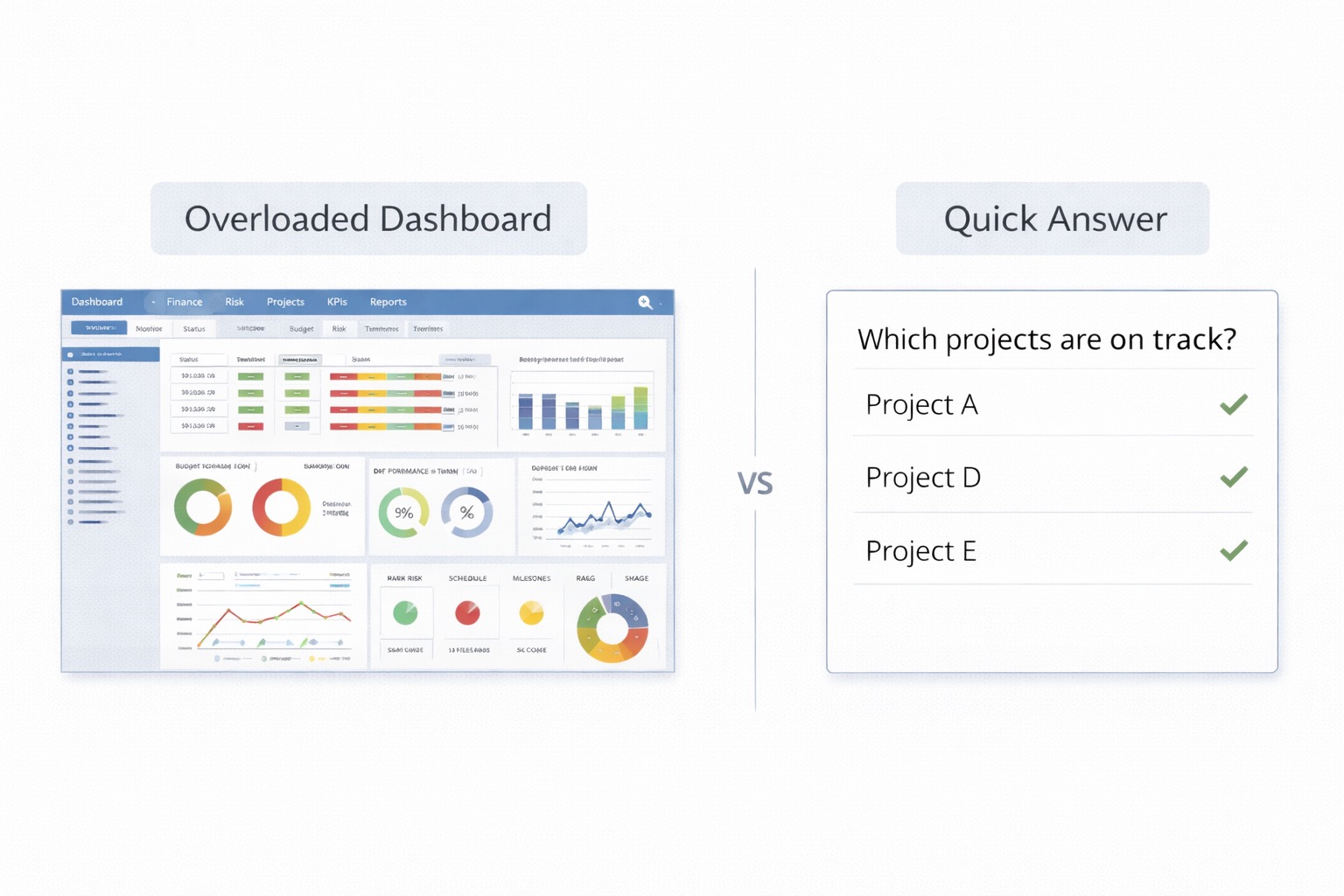
The irony is that the most sophisticated dashboards are often the ones that get the least use at the governance level. Sophistication is not the same as usefulness. A dashboard that answers one question clearly and instantly is more valuable in a ten-minute pre-meeting review than a dashboard that can answer one hundred questions if you spend thirty minutes with it.
The three questions.
Three questions come up in every portfolio governance meeting. Building a dashboard around them, literally structuring the views to answer them in order, produces the tool that leadership uses.
What is at risk of missing commitments we have made externally? Not all project risk is equally important. Leadership cares most about risk that threatens commitments they have made to the board, to regulators, to customers, or to other parts of the organisation. A dashboard that surfaces this kind of risk explicitly, flagging projects whose delays or failures would cascade into external commitments, is answering the question that is actually in the room, not just showing which projects are amber.
Is the budget going where we decided to put it? This is not the same question as "are we over or under budget?" The more useful version asks: are we spending in proportion to our stated strategic priorities? A portfolio that is overspending on maintenance and underspending on transformation is providing a governance signal that no project-level budget variance report captures. The dashboard view that compares actual spend allocation against strategic priority buckets, even roughly, is the one that generates the most useful governance conversations.
What do we need to decide before the next meeting? This is the hardest view to build because it requires human synthesis, not just data. But a well-designed dashboard can support it. Surface the decisions that are currently unresolved and time-sensitive. Flag the projects waiting on a commitment that has not been made. Highlight escalations approaching a threshold. The PMO needs to curate this view, it cannot be fully automated, but the dashboard provides the data scaffold that makes the curation manageable.
Design principles.
These principles are the opposite of what most BI teams default to. Show the answer first, with data behind it. If there are three projects at risk of missing external commitments, show three project names and the specific commitments at risk. Not a table of all projects and their RAG status from which leadership must infer the answer themselves. Drill-down is for people who want to verify the answer, not for people who need to find it.
Keep the number of views minimal. One view per question, with a drill-down layer if needed. No decorative charts. No views that exist because someone thought the data was interesting. Every element should earn its place by answering one of the three questions or helping someone verify an answer.
Make the time dimension explicit. A dashboard that shows current state without surfacing trajectory is missing the most important information for a decision-maker. Whether things are getting better or worse matters more than where they stand today. Trend indicators and cycle-over-cycle comparisons should be visible on the main views, not hidden behind filters.
How to know if your dashboard is working.
There is one reliable test. Track how many questions in your governance meeting were answered by the dashboard before anyone asked them. If the answer is most of them, the dashboard is working. If leadership is regularly asking questions that send the PMO lead digging through reports after the meeting, it is not working, regardless of how impressive it looks.
A secondary test is simpler. Ask two or three leadership stakeholders what they do with the dashboard in the twenty minutes before a steering meeting. If the answer is "I open it and spend five minutes reviewing the key views," it is working. If the answer is "I ask my EA to pull a summary," it is not, even if the capability is technically there.
The tool matters less than people think. Power BI, SAP Analytics Cloud and Tableau are all capable of building something that works. The tool is almost irrelevant. What matters is whether the team building the dashboard has spent more time with governance stakeholders than with the data team. In most organisations, the ratio is the wrong way round.
Philipp Eiselt
Independent consultant in IT Portfolio Management, PMO & Governance, and Digital Transformation. Based in APAC, working globally.
Follow on LinkedInMore to read.

Zero-Downtime Migration: What 92% Test Coverage Means